* All product/brand names, logos, and trademarks are property of their respective owners.
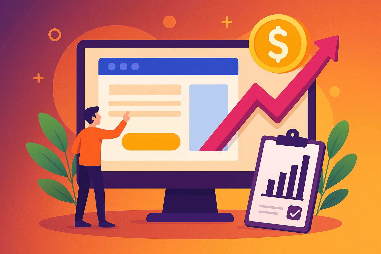
If you're getting traffic to your website but your landing pages aren't converting, you're not alone. Many businesses pour time and money into ads, SEO, and content only to lose potential leads right at the finish line. Why? Because their landing pages aren't doing the one job they’re meant to do: convert visitors into customers.
The good news? You don’t need to redesign your entire landing page or hire an expensive CRO agency to start seeing results. Often, just a few strategic tweaks can create a big impact. Think of it like tuning up a car engine it might be running, but with a few small adjustments, it can run better, faster, and more efficiently.
In this blog, we'll break down five simple but powerful landing page tweaks that can instantly improve your conversion rates. Whether you're running an ecommerce site, collecting leads, or promoting a service, these tips are practical, easy to implement, and backed by what’s already working for top-performing brands.
Here’s a sneak peek of what we’ll cover:
Why your headline and hero section might be scaring users away
How to streamline your design and optimize your CTAs for better flow
And the one thing many landing pages forget building trust and loading fast on mobile
By the end of this post, you'll have a clear action plan to boost conversions without a complete redesign. Let's get into it.
When someone lands on your page, you have just a few seconds to grab their attention and your headline and above-the-fold section are your best tools to do it. This is your first impression, and it needs to be crystal clear, benefit-focused, and compelling enough to make the visitor want to scroll down.
Your headline isn’t just a title it’s a pitch. Instead of vague or clever phrases, focus on what the user will gain. People don’t care what your product does they care about what it does for them.
Bad Example: “Reimagine Your Workspace”
Better Example: “Get More Done with an Organized, Clutter-Free Workspace”
Use active language and clarity over creativity. If your visitor has to guess what you’re offering, you've already lost them.
Your headline hooks them in, but your subheading and hero section content should seal the deal. Explain your offer in a sentence or two this isn’t the time for jargon. Focus on benefits and what the user gets by continuing.
Also, consider including a bullet point list of key benefits, or a brief explainer video to make the value even more obvious.
What users see without scrolling (above-the-fold) should clearly show:
What your offer is
Why it matters
What they should do next (your CTA)
This section should include:
Your headline + subheading
One strong visual (image or video)
A clear, action-oriented CTA button
Whether it’s “Start Your Free Trial,” “Get Instant Access,” or “Download Now”make sure it’s direct and benefits-focused.
A strong above-the-fold experience can increase engagement dramatically sometimes by 2x or more. Don’t bury your best content below the fold put it front and center.
Design isn’t just about aesthetics it’s about guiding your visitor to take action. A cluttered, confusing layout or poorly placed call-to-action (CTA) can tank your conversion rate, even if your offer is strong.
Let’s look at how to clean up your layout and craft CTAs that actually convert.
One of the most common landing page mistakes is trying to say or show too much. You might think more information is better but it often overwhelms visitors and causes them to bounce.
Here’s how to declutter your design:
Stick to one main goal per page (e.g., sign up, download, buy)
Remove unnecessary links, sidebars, or menus that could lead users away
Keep copy short and punchy focus on benefits, not features
Use whitespace to draw attention to key elements
Ask yourself: Is this element helping or distracting from the conversion goal? If it’s not helping remove it.
Your CTA is arguably the most important element on the page. It should be:
Visible without scrolling
Repeated throughout the page (but not spammy)
Action-oriented (e.g., “Get My Free Trial” vs. “Submit”)
Also, try using a secondary CTA for visitors who aren’t quite ready to commit. Example:
Primary CTA: “Buy Now”
Secondary CTA: “Learn More” or “See How It Works”
The goal is to move every visitor forward, even if it’s just one step.
Use visual cues to guide your visitor’s eye from the headline to the CTA. Some tips:
Use larger fonts for key messages
Bold or highlight key phrases
Use arrows, icons, or images that point toward your CTA
A well-designed visual flow keeps the user focused and increases the chance they’ll take action.
Small layout changes like repositioning your CTA, reducing copy, or emphasizing key visuals can create big conversion gains. The best part? These tweaks are quick to implement and easy to A/B test.
Even if your landing page is well-designed and persuasive, visitors won’t convert unless they trust you. At the same time, if your page isn’t mobile-friendly, you’re losing out on a massive share of traffic. Let’s fix both.
Social proof is one of the most powerful psychological triggers you can use on a landing page. It reduces hesitation and reassures visitors that others have benefited from your offer.
Here’s how to do it right:
Include real, specific testimonials generic praise like “Great product!” doesn’t build trust. Use quotes that explain what problem was solved.
Add names, photos, and company names to make testimonials feel authentic.
Display client logos if you work with notable companies or partners.
Use star ratings or media mentions if available they instantly signal credibility.
Bonus tip: Place social proof near your CTA sections to reinforce the decision to convert.
More than 60% of web traffic comes from mobile devices. If your landing page takes too long to load or looks broken on mobile, visitors will bounce before they even see your offer.
Quick optimization wins:
Compress images and use modern formats like WebP
Use a mobile-first responsive layout test on multiple screen sizes
Avoid pop-ups that are hard to close on smaller devices
Keep buttons large enough to tap with a thumb
Use tools like Google PageSpeed Insights or GTmetrix to find and fix slow-loading elements. A one-second delay in load time can reduce conversions by up to 20%!
Once your trust-building and mobile optimizations are in place, run A/B tests to fine-tune:
Testimonials vs. case studies
Different CTA button text
Desktop vs. mobile layouts
Visuals (e.g., product images vs. customer photos)
Testing doesn’t have to be complicated start small and let the data guide you.
Trust and usability are conversion powerhouses. When visitors feel confident in you and can easily engage on any device, they’re far more likely to take action.
Improving your landing page’s conversion rate doesn’t always require a full redesign or a complex CRO strategy. Often, the biggest wins come from small, focused tweaks the kind that are easy to implement and even easier to test.
Let’s quickly recap the 5 powerful landing page tweaks we covered:
Upgrade your headline and hero section – Make sure your value is clear the moment someone lands on your page.
Refine layout and CTAs – Remove distractions, guide the eye, and place action buttons where they matter most.
Use strong social proof – Show potential customers they can trust you by using authentic testimonials, reviews, or client logos.
Optimize for mobile – Make your site fast, responsive, and easy to navigate on any device.
Run simple A/B tests – Don’t guess what works. Test different variations and let the data decide.
These changes might seem small, but together, they can create a huge uplift in conversions whether your goal is leads, sales, sign-ups, or something else.
If you're unsure where to begin, start with just one tweak today maybe your headline or CTA. Watch how it performs, and then move to the next. You’ll be surprised how quickly small adjustments can deliver big results.
Ready to take action?
Pick one tweak from this list, apply it to your landing page, and monitor the results over the next 7 days. Got questions or want feedback? Drop a comment or reach out we’d love to hear how it goes!
No bio available yet.
Moving from manual work to AI-powered systems sounds exciting, but it can also feel risky without a
27 April 2026
Let’s be blunt: generic marketing is dead. In an ultra-competitive digital ecosystem wher
22 January 2026
Are your marketing efforts actually driving results — or are you just guessing? In today&rsquo
14 January 2026
Be the first to share your thoughts
No comments yet. Be the first to comment!
Share your thoughts and join the discussion below.

.webp&w=3840&q=75)
.webp&w=3840&q=75)