* All product/brand names, logos, and trademarks are property of their respective owners.
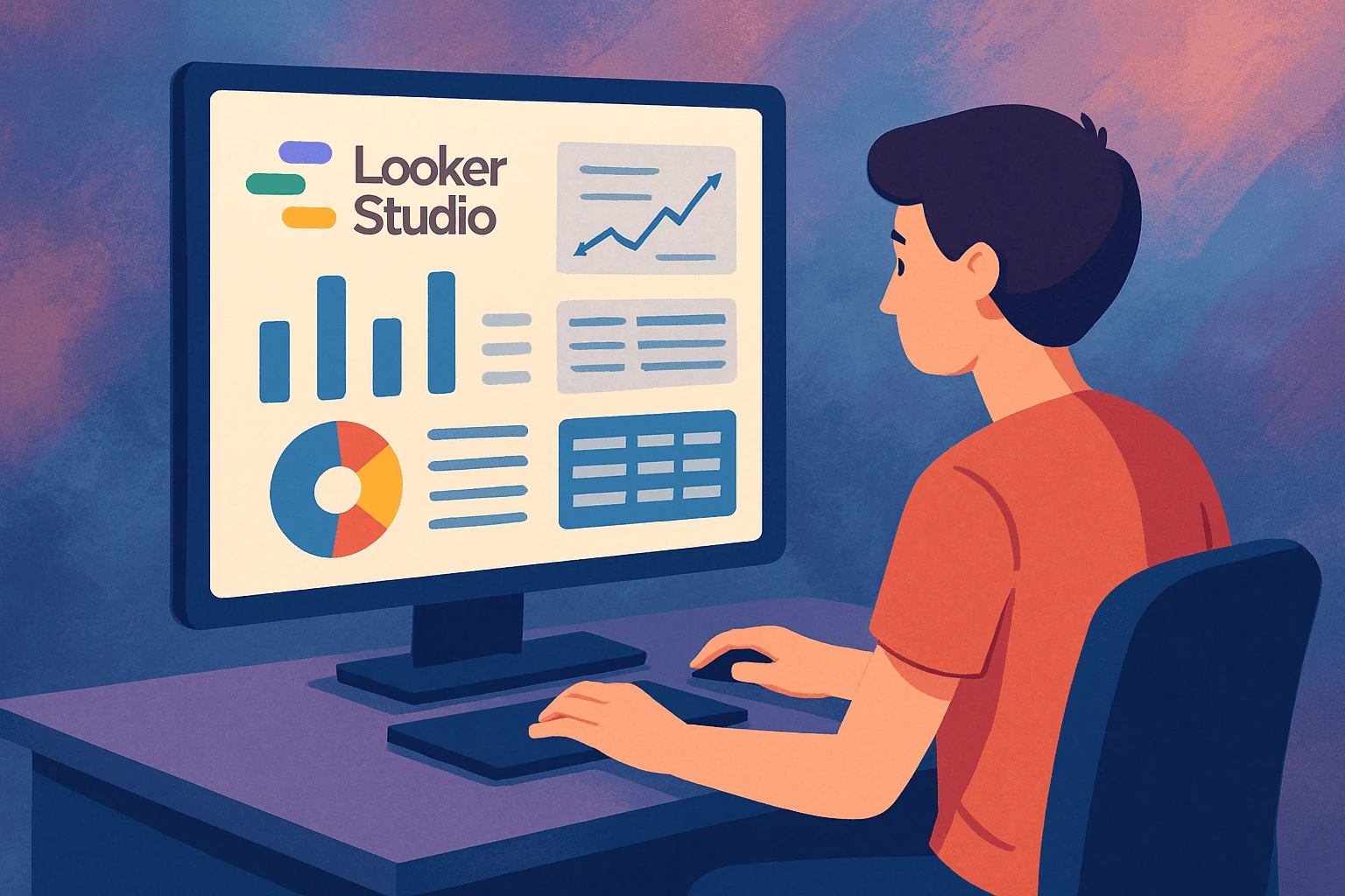
Have you ever wanted to turn your data into beautiful, easy-to-understand reports without needing any tech or coding skills? If yes, then you’re going to love Looker Studio (formerly known as Google Data Studio). This free tool by Google lets you connect your data, build dashboards, and share reports that actually make sense and the best part? You don’t need any prior experience to get started.
Looker Studio is designed for beginners. Whether you're a small business owner tracking website traffic, a student managing research data, or just someone curious about data visualization, this guide will walk you through building your first Looker Studio dashboard from scratch no jargon, no confusion, and absolutely no prior experience needed.
In today’s digital world, data is everywhere but understanding that data is often the hardest part. That’s where dashboards come in. A good dashboard takes raw numbers and turns them into clean visuals: line charts, scorecards, pie charts, tables whatever helps you understand your story better. With Looker Studio, you can do all this in just a few clicks.
This beginner-friendly tutorial will show you:
How to set up Looker Studio for the first time
How to connect it to real data sources like Google Sheets or Google Analytics 4 (GA4)
How to build a working dashboard — with charts, filters, and visuals
How to customize it with colors, themes, and sharing options
By the end of this blog, you’ll be confident enough to create, style, and share a fully functioning dashboard even if today is your first time hearing about Looker Studio.
Let’s jump in and build your first dashboard step by step!
Creating your first dashboard in Looker Studio might sound intimidating but it’s easier than you think. This section will walk you through the full process from logging in to visualizing your very first report. Let's get started!
First things first to use Looker Studio, all you need is a Google account (Gmail will do just fine). Once you're logged in:
Go to lookerstudio.google.com
Click “Blank Report” to start a new dashboard
You’ll be prompted to add your first data source (we’ll cover that next)
Here’s a quick tour of what you’ll see:
Toolbar at the top: Add charts, text, images, etc.
Left Sidebar: Manage pages, data, and layout settings
Canvas Area: Where you build your dashboard visually
Pro tip: Don’t worry about perfect layout or design yet. Just get comfortable with where things are.
This is where the magic starts you’re going to plug real data into your dashboard.
You’ll see a list of available connectors these let Looker Studio pull in data from different platforms. For beginners, we recommend:
Google Sheets (easiest to control and customize)
Google Analytics 4 (GA4) (perfect for tracking website traffic)
Let’s say you choose Google Sheets:
Pick the sheet with your data (e.g., sales data, traffic logs)
Choose the worksheet/tab you want
Click “Add” then “Add to Report”
Now your data is live inside Looker Studio.
For local users: You can also create a simple Excel-style sheet in Google Sheets with dummy data (like monthly sales, cities, or product types) to test things out.
Time to build!
Click “Add a chart” from the toolbar here are the top 3 elements to start with:
Scorecards: Show single, high-level numbers like total sales or users
Time Series Charts: Perfect for trends (e.g., daily visits or monthly revenue)
Tables: Let you break down data with filters and dimensions
Start simple:
Add a scorecard showing “Total Sales”
Add a line chart showing “Sales Over Time”
Insert a table to show “Sales by City” or “Top Products”
Drag and drop the charts where you want them, resize as needed, and click around to customize labels, metrics, and styles.
Within minutes, you’ve just created your first dashboard layout. How cool is that?
Now that you’ve got your first dashboard set up with real data, it’s time to make it not only functional but also visually appealing and easy to use. In this section, we’ll cover how to style your dashboard, add interactive elements, and share it with others like a pro.
A clean, professional-looking dashboard is easier to read and makes you look like a data pro, even if you're just starting out.
Here’s how to personalize your design:
Themes: Click on the “Theme and Layout” tab to select a pre-designed look or create your own by customizing colors and fonts.
Colors: Choose brand colors or calming tones. Use consistent colors for related data (e.g., blue for sales, green for growth).
Fonts: Stick with clean, legible fonts like Roboto, Open Sans, or Arial. Avoid over-styling.
Spacing & Alignment: Use gridlines to align your elements neatly. Keep white space around charts to avoid clutter.
Quick tip: Don’t go overboard keep it simple and clean. The goal is clarity, not decoration.
Want your dashboard users to control what they see? Interactivity is your best friend.
Here are two must-add features:
Date Range Controls
Go to Insert → Date Range Control
Place it at the top of your dashboard
This lets users choose the time period they want to analyze (e.g., last 7 days, last month)
Filter Controls
Go to Insert → Filter Control
Set filters like “City,” “Product,” or “Channel”
Now users can focus on the data that matters most to them
Example: A user clicks “Karachi” in your filter, and all the charts instantly update to show only Karachi’s data. It’s that smooth!
This is especially helpful for dashboards shared with teams, clients, or managers who need specific views.
Your dashboard is ready now let’s share it!
You have several options:
Live Share Link
Click “Share” in the top-right corner
Set view/edit permissions
Copy and send the link just like you would with Google Docs
Export as PDF
Great for reports or presentations
Click File → Download → PDF
Embed in Website or Blog
Go to File → Embed Report
Copy the iframe code and paste it into your site
Present Mode
Use the built-in View mode to display your dashboard during meetings
Looks clean and removes edit tools from view
Whether it’s for a school project, internal reporting, or client work Looker Studio makes sharing seamless.
If you’ve followed along, you’ve just taken your first confident step into the world of data visualization and you did it without needing any prior experience. That’s the power of Looker Studio. It’s not just a tool for analysts or marketers it’s for anyone who wants to understand their data, share insights, and make smarter decisions.
Let’s quickly recap what you’ve achieved:
Set up Looker Studio and navigated its interface like a pro
Connected real data from Google Sheets or Google Analytics
Built a functional dashboard using scorecards, charts, and tables
Styled and customized your visuals with themes, filters, and fonts
Added interactivity and learned how to share your work with others
Not bad for a complete beginner, right?
The beauty of Looker Studio is that you can start small like a basic sales report and gradually build more advanced dashboards as you gain confidence. You’ll soon be adding calculated metrics, combining multiple data sources, or even creating SEO and marketing dashboards that wow your clients or colleagues.
So what’s next?
Take action now. Open Looker Studio, grab some data (even a simple spreadsheet), and start building. The more you play around with it, the faster you’ll learn.
Have a question? Got stuck somewhere? Leave a comment or message — and I’ll help you out!
No bio available yet.
Setting up Google Analytics may seem technical at first, but the process is much simpler when you br
30 May 2026
Digital payments have changed the way people shop, pay bills, and run businesses online. Instead of
23 May 2026
Learning how to use AI tools for everyday work is not really about replacing your effort. It is
23 April 2026
Be the first to share your thoughts
No comments yet. Be the first to comment!
Share your thoughts and join the discussion below.