* All product/brand names, logos, and trademarks are property of their respective owners.
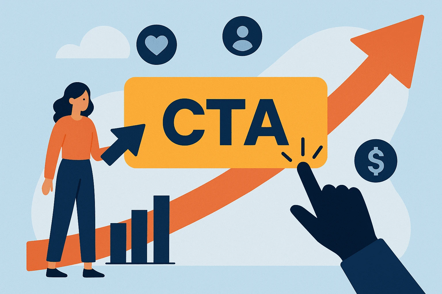
Think of a Call to Action (CTA) as the moment of truth in your content the final nudge that turns a passive visitor into an active customer, subscriber, or lead. It’s that one button, line, or message that says: “Click here,” “Buy now,” “Start your free trial.”
But here’s the catch: even if your content is amazing, if your CTA falls flat you lose. A weak or unclear CTA can mean thousands of missed clicks, abandoned carts, and wasted ad spend. On the flip side, a well-optimized CTA can skyrocket your engagement and double (or even triple) your conversions.
In today’s digital landscape, attention spans are short and competition is fierce. Every visitor counts. That’s why optimizing your CTAs isn’t just a design choice it’s a revenue strategy. Whether you're running an e-commerce store, publishing blog content, or offering services in Pakistan or abroad, a smart CTA can make all the difference.
Here’s the good news: improving your CTAs doesn’t require a full website redesign or a marketing degree. In this blog, we’ll walk you through exactly how to:
Whether you're new to digital marketing or looking to level up your results, this guide will give you practical, real-world tips to turn your CTAs from “meh” to magnetic.
Ready to learn how to optimize your CTAs for better engagement and conversions? Let’s dive in.
This section will break down proven techniques for writing CTAs that actually get clicks using persuasive language and psychological triggers.
When it comes to writing a CTA, every word counts. A strong CTA uses action-oriented verbs that make the next step clear and enticing. Instead of a vague “Submit” or “Click Here,” try phrases like:
“Download Your Free Guide”
“Start My Free Trial”
“Book a Free Consultation”
“Get Instant Access”
Notice the difference? These CTAs tell users exactly what they’ll get and they make the offer feel immediate and valuable.
But the best CTAs don’t just tell you what to do they tell you why. That’s where benefit-driven language comes in. Highlight the result or transformation. For example:
“Save Time with Our Easy-to-Use Template”
“Boost Sales with Proven Marketing Tools”
“Get More Leads Without Spending More on Ads”
It’s not just about clicking it’s about making users feel like they’re gaining something meaningful.
Creating urgency is a classic psychological trick and it works. People are more likely to act when they feel they might miss out.
Phrases like:
“Offer Ends Tonight”
“Only 5 Spots Left”
“Limited Time Discount”
“Last Chance to Enroll”
These trigger what’s called FOMO (fear of missing out). Just be careful fake urgency can hurt your credibility. Always back it up with real deadlines or limited offers.
For local audiences in Pakistan, you can even add a cultural touch:
“Ramzan Offer Ending Soon!”
“Exclusive Discount for Karachi Shoppers Today Only!”
Blending urgency with authenticity builds trust and drives faster action.
This section will explore how visual design, smart placement, and mobile UX play a massive role in how users engage with your CTAs.
Design isn’t just about looking good it’s about standing out. A great CTA must visually pop from the rest of the page without looking out of place.
Here’s what matters most:
Color Contrast: Your CTA button should clearly contrast with the background. If your site is mostly blue, use a bright orange or green button to make it stand out.
Size & Shape: It needs to be big enough to be noticeable but not overwhelming. Use rounded buttons with padding to make them feel clickable.
White Space: Don’t crowd your CTA. Give it breathing room so it naturally catches the eye.
Font & Icons: Use a clear, bold font. A small arrow or icon next to the text can improve click rates by subtly reinforcing the action.
Tip: Make sure your CTA passes the 5-second test if someone glances at the page and can’t instantly spot your CTA, you need to redesign it.
Even the best CTA won’t work if it’s hiding in the wrong place. Placement is key to engagement.
Top-performing spots include:
Above the fold: Users see it without scrolling.
After value: Place it after explaining the benefits or solving a problem.
End of content: Especially effective for blogs when someone finishes reading, they’re more likely to act.
Sticky CTAs: A floating bar on mobile or desktop keeps the CTA visible as users scroll.
Avoid placing CTAs too early, like right at the top before the reader knows what you’re offering unless it’s a returning visitor landing page.
In Pakistan (and globally), most users browse on mobile. Yet many CTAs are still designed only with desktop in mind. That’s a problem.
Here’s how to fix it:
Thumb Zones: Make sure CTAs are easily tappable with one thumb. Avoid placing buttons at the far top corners.
Button Size: Tap targets should be large and spaced well. A tiny button on a small screen = frustration = no click.
Responsive Design: Your CTA should look great and function well across all devices no broken layouts or cut-off text.
Sticky Bottom Buttons: These work great on mobile always visible and easy to tap.
Also test for load speed. Heavy images or animations can slow things down and kill conversions especially on slower mobile networks in some parts of Pakistan.
You’ve crafted a compelling CTA and placed it perfectly. Now it’s time to refine, test, and track because what works for one audience may flop with another.
Don’t guess test. A/B testing (also called split testing) helps you compare two versions of a CTA to see which performs better. The beauty is, you don’t need a huge budget or fancy tools to do it.
Free or Low-Cost A/B Testing Tools:
Google Optimize (free)
VWO
HubSpot A/B testing (built-in)
Hotjar (for heatmaps & user clicks)
What to Test in a CTA:
Button text: “Download Now” vs. “Get the Free Guide”
Color: Blue vs. green
Placement: End of article vs. sidebar
Size or font
With vs. without icon
Static vs. animated CTA
Start small change one thing at a time. Run the test for at least 7 days or until you hit 500+ visitors per version for meaningful results.
Today’s users expect personalized experiences. A generic CTA might work but a tailored one can work much better.
Ways to Personalize CTAs:
User type: New visitor? Say “Get Started.” Returning user? Try “Continue Where You Left Off.”
Traffic source: Someone from Facebook might respond better to casual CTAs; someone from LinkedIn might prefer professional tone.
Location: “Exclusive Offer for Karachi Customers” adds a local connection.
Language: For Pakistan, offer bilingual CTAs where appropriate (English/Urdu). It boosts accessibility and trust.
Tools like HubSpot, Mailchimp, or Elementor (for WordPress) let you create dynamic content based on user data no code needed.
Click-through rate (CTR) is the first number people look at but it’s not the only one that matters.
Track These Too:
Conversion Rate: How many users actually completed the desired action (not just clicked).
Bounce After Click: If users click but then leave quickly, your CTA may be misleading.
Scroll Depth: Did users even see your CTA?
Heatmaps: Tools like Hotjar show where users are clicking (or not).
Time on Page: A well-placed CTA often improves time spent engaging with your content.
Set up goals in Google Analytics to see how your CTAs contribute to your overall objectives whether that’s downloads, sales, sign-ups, or something else.
While global CTA strategies work well, local businesses in Pakistan have unique challenges and opportunities. This section focuses on culturally-relevant, effective CTA strategies for your specific audience.
In Pakistan, language and tone make a huge difference. While English CTAs work for urban, tech-savvy audiences, many people respond better to content in Urdu or a mix of both languages.
Examples of bilingual CTAs:
“ابھی آرڈر کریں (Order Now)”
“Sign Up – مفت مشورہ حاصل کریں (Get Free Advice)”
“Download کریں اپنا Discount Coupon”
Using local phrases not only boosts clarity but also builds trust and relatability. You’re showing that your brand speaks the language of its customers literally.
Additionally, keep in mind cultural norms:
Avoid overly aggressive or “salesy” language.
Politeness, respect, and helpfulness go a long way.
Use words like Free, Trusted, Secure, and Local they resonate strongly.
Let’s look at a few real or inspired examples of how Pakistani brands effectively use CTAs:
CTA Example: “Add to Cart Now & Get Free Delivery”
Combines urgency + benefit
Highlights savings, a strong motivator for price-sensitive users
CTA Example: “Order Now – Get 20% Off in Lahore!”
Hyper-local CTA, tailored by city
Great use of discount + location relevance
CTA Example: “Get a Free Property Evaluation Today”
Uses trust-building language (“Free”, “Evaluation”)
Appeals to value-conscious buyers and sellers
CTA Example: “Start Your Career Journey – Enroll Today”
Aspirational language tied to personal growth
Ideal for universities, online courses, coaching centers
You don’t need a massive budget to use smart CTAs. Here’s how local SMBs can apply these strategies:
Use WhatsApp as a CTA:
“Message Us on WhatsApp” is extremely effective in Pakistan where WhatsApp is widely used for business.
Localized offers:
“Lahore Special Deal — Limited Time Only” works better than generic discounts.
Show trust signals:
Add badges like “100% Halal”, “Trusted by 10,000+ Customers in Pakistan”, or “5-Star Reviews on Daraz”.
Use Cash-on-Delivery incentives:
“Order Now — Pay Cash on Delivery” addresses a big local trust concern.
CTAs might look small a button here, a line of text there but they have a massive impact on how users interact with your content, offers, and brand. When optimized properly, CTAs can transform passive visitors into loyal customers, email subscribers, or enthusiastic leads.
Let’s recap what we’ve covered:
Whether you're a blogger, digital marketer, small business owner, or part of a larger organization, remember this: a great CTA isn’t just a button it’s a conversation starter. It invites your audience to take the next step, to trust you, and to engage more deeply with what you offer.
Want to put this into action?
Start by picking one of your current CTAs maybe on your homepage, your blog, or your product page. Use the tips from this guide to rewrite it, redesign it, or reposition it. Then, test the results.
Whether you're serving customers in Pakistan or reaching a global audience, the principles of a strong CTA remain the same: be clear, be compelling, and make it easy to say yes.
Ready to boost your conversions and create CTAs that actually work?
Let’s get started.
No bio available yet.
Moving from manual work to AI-powered systems sounds exciting, but it can also feel risky without a
27 April 2026
Let’s be blunt: generic marketing is dead. In an ultra-competitive digital ecosystem wher
22 January 2026
Are your marketing efforts actually driving results — or are you just guessing? In today&rsquo
14 January 2026
Be the first to share your thoughts
No comments yet. Be the first to comment!
Share your thoughts and join the discussion below.

.webp&w=3840&q=75)
.webp&w=3840&q=75)